Bootstrap Design & Development
Bootstrap is a front-end framework for HTML, CSS and JavaScript that is notable for developing mobile-first and responsive websites. With some basic knowledge of HTML and CSS, you can create Bootstrap forms, tables, buttons, typography, navigation, modals, image carousels and optional JavaScript plugins, by using the premade templates Bootstrap provides you.
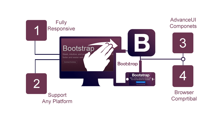
1. Responsive :— Bootstrap's features are responsive, which means they are optimized to fit the size of the screen you're seeing the page on, such as desktops, tablets or cell phones. For example, a Bootstrap form on a desktop site will proportionally change in size when viewed from a mobile phone.
2. Mobile-first :— As we mentioned above, part of the core structure of Bootstrap is mobile-first styles as opposed to desktop-first. This means that instead of using max-width in the media queries- like you would for a site designed for desktop- you use min-width. Generally, coding for mobile-first is simpler than coding for desktop. Also, where global styles (outside the media queries) are usually designed to make websites look nice on a large screen, a mobile-first approach focuses on sites looking attractive on a small screen.
3. Browser-friendly :— Bootstrap doesn't discriminate, which is why it is compatible with all current browsers, like Chrome, Safari, Internet Explorer, Firefox, and Opera.
4. Easy-to-use :— The best reason of them all! You only need very barebones knowledge of HTML and CSS to begin using Bootstrap.
Ready to get started from
Cyber Impulse Software Solutions is specialized in creative web designing and development.
Android and ios app design and development and also one of the leading and fastest software development company
Our Skill
company specialized in creative web designing and development , Android and ios app
design and development and also one of the leading and fastest software development company
100%
Web Design
95%
PHP & Wordpress
98%
Android
95%
IOS